
The shirtwaist dress, the military jacket, the pea coat, the jumpsuit, the striped Breton shirt, the trench coat, the safari jacket, the sailor pant, the camouflage print, the branded athletic wear — although this reads like a list of must-haves for today’s fashion conscious woman it is actually an itemization of clothing styles that have roots in the “lowly” uniform. Yesterday I attended the press preview for FIT’s newest exhibition “Uniformity,” on view until November 19, which culls 70 items, primarily from FIT’s permanent collection.
 |
| Curator Emma McClendon |
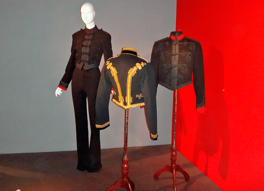
Curator Emma McClendon was a wealth of knowledge on a subject that I didn’t expect to find interesting. Boy, was I wrong on that count! The exhibition takes on all four categories of uniforms: Military, Work, School and Athletic in separate sections. Here you can see an original uniform displayed alongside its high fashion version. According to McClendon, “uniforms have a very strong aesthetic.
Designers are particularly drawn to military uniforms as they convey power and authority. Although they are designed for mass production they are functional, good looking garments.” McClendon attributes the fact that the museum counts many military pieces in their permanent collection to former curator of FIT and of the Met’s Costume Institute Richard Martin (1946-1999) who was “very interested in the socio-political aspect of fashion.”
 |
| Video of Stan Herman & Thom Browne |
At the beginning of the exhibition is a video in which former president of the CFDA and “Go-to” uniform designer Stan Herman as well as men’s and women’s wear designer Thom Browne speak about their experiences and thoughts on the uniform. Herman had designed the red Avis uniforms and was then asked in 1975 to design for TWA. “They wanted color. Color is the most important thing in uniforms. It represents who these corporations are.” What they got was yellow, orange, cobalt blue and beige, complete with a patterned scarf which could be worn in any fashion expressing the wearer’s individuality, all on view here.
 |
| Stan Herman’s TWA uniforms 1975 |
Herman also designed the Federal Express uniforms, re-working them for the now ubiquitous FedEx logo, as well as the 1976 McDonald’s uniforms– in the video he says he “was shocked” when asked to design the first company-wide uniform for the fast food chain. Herman attributes his love for uniforms to his “orderly mind.” Interestingly, Stan showed up briefly yesterday to check out the exhibition, asking when the party was only to be told that there was no party for the exhibitions in this smaller space. He also mentioned that he had bought the McDonalds uniform on eBay which he donated to the museum along with the TWA uniforms which presumably he had saved. Herman now designs for Jet Blue and was reminiscing about the condition of the old landmarked TWA Eero Saarinen at JFK building, now in partial use by Jet Blue.
 |
| Stan Herman views his McDonald’s uniform next to Moschino’s fashion version, Chanel, Brasserie Gabrielle ensemble, fall 2015 |
Thom Browne did not make an appearance other than on video, saying this: “I went to Catholic school and as a kid wearing a uniform was important because it freed us up from having to think about clothes.” He admits that as a designer he references uniforms all the time by “reinterpreting the classics” and “playing with proportion.” Browne’s 2009 Pitti Florence fashion show was a study on the classic white collar man’s uniform of a suit yet he tweaks it with elements of a school boy uniform (an example can be seen displayed next to an Eton suit in the exhibition). The theme of a love/hate relationship to uniforms is revealed — Browne’s theory is that you get to see the real person when you’re not looking at the clothing — kind of an odd belief for a fashion designer.
A video sequence on the wall in the last room displays one of Thom Browne’s recent shows which are always fantastical, theatrical collections set in elaborate and evocative sets; another screen shows Karl Lagerfeld’s Chanel airport show at the Grand Palais, while a third row of screens features one of Jean Paul Gaultier’s shows as well as his perfume commercials featuring the ever-present breton shirt and sailor uniform, now fetishized. Side note: Did you know that the stripes on a sailor shirt were originally there to make it easier to spot someone who went overboard?
 |
| Stylized designer camouflage including John Bartlett’s dog print (left), an example of British Camouflage |
At the various displays McClendon gave us several interesting facts about uniforms. It was fascinating to learn that the braiding and knot detailing seen on military jackets was originally designed as protection from hand-to-hand combat; that the original khaki or olive drab color used in WWI and WWII ( a “puke” green color) was not regarded highly and eventually phased out in favor of a grayer “army green;” that camouflage (developed in WWI) allows you to blend in but also to stand out, or at least the fashion versions in brighter colors do.
 |
| Left:Oscar de la Renta’s Eveningwear Center: Jean Paul Gaultier; Right Sacai |
That both the nurse’s uniform and school girl’s uniform became sexualized into the second half of the 20th century; that the sailor suit originally crossed over into the fashion world through children’s wear, then into women’s wear for “activewear purposes” including as beachwear or for playing tennis circa 1940’s; and finally the idea that there is something subversive about outfitting women in military looks initially designed for men. Of course, now everything is trending towards the unisex and being watered down, making that dichotomy a thing of the past. A good example of this is that the nurse’s dress has been replaced by scrubs since men entered the nursing profession.
 |
| Original coverall, flight suits, Lauren Bacall’s Fiorucci Jumpsuit from the ’70s |
The jumpsuit, so named because paratroopers jumped out of planes in them, was actually a spin-off of the coverall made by Henry David Lee (inventor of Lee Jeans) in 1913 who made one for his chauffeur to fix the car in. The jumpsuit started out in an olive drab but was eventually made in other colors once flame retardant fabric was invented. On display is a hot pink Fiorucci jumpsuit, donated by Lauren Bacall who wore it in the ’70s when she would have been in her fifties, notes McClendon.
 |
| Geoffrey Beene, Football jersey dress, fall 1967 |
Lastly, is the sports themed platform, which is where bright colors, logos, prominent insignias and even more branding really arrive on the scene in order to differentiate between teams on the playing field. McClendon mentions with pride that the museum’s new acquisition of the white Geoffrey Beene 1967 sequined “football jersey” dress (which appeared on the Harper’s Bazaar’s cover) is her favorite piece of the exhibition.
 |
| Various examples of branding in athletic wear |
When asked a question about the popularity of the Vetements DHL uniform T-shirts, McClendon just shook her head and said that she finds people’s reaction to the sold out $330 shirt to be the most interesting aspect of the whole thing. “Meta-ism” of the week: If you order the Vetements DHL shirt, does it get delivered by DHL?
– Laurel Marcus